Colour
Definition:
The property possessed by an object of producing different sensations on the eye as a result of the way it reflects or emits light. Colour can also present moods and reflects emotion.
Colour and Emotion


Coldplay - Yellow
The colours throughout the music video help present the mood of the lyrics/song. It begins with dark colours and a low brightness and as the music video progresses the colours become brighter and more vibrant.

Amy Winehouse - Tears dry on their own
In comparison to Coldplay we have Amy Winehouse's music video which had vibrant colours throughout to represent the bright and hopeful mood throughout the song.
Colours and what they represent:
Each colour can represent an emotional, physical and behavioural sensation.Red - This colour is linked with the emotions of passion, love, strength and anger.
Physically it can represent raised blood pressure, raised heart rate and can also stimulate appetite.
Behaviourally it represents heat, aggression, danger, and stop.
Orange - This colour is linked with the emotions of happiness, energetic, pleasant, social.
Physically it can represent movement, energy, vigour and encouragement
Behaviourally it represents movement and fastfood
Yellow - This colour is linked with the emotions of warmth, cheerful, solitary, irritable
Physically it can represent poor skin, reflection, and brightness.
Behaviourally it represents liveliness, security, caution and slow
Green - This colour is linked with the emotions of friendliness, calming, neutral and balanced
Physically it can represent concentration, focus and attention
Behaviourally it represents jealousy, envy, money and avarice
Blue - This colour is linked with the emotions of isolation, peaceful, cool and distant
Physically it can represent lowered blood pressure, and decreased appetite
Behaviourally it represents calm, conservative, loyal and trusting.
Purple - This colour is linked with the emotions of spiritual, enlightened,creative and artistic
Physically it can represent calming, relaxing and helps insomnia
Behaviourally it represents surprise, magic, regal, royal and rare
Definitions:
Analogous Colours - Analogous colours are groups of three colours that are next to each other on the colour wheel, sharing a common colour, with one being the dominant colour, which tends to be a primary or secondary colour, and a tertiary. Red, orange, and red-orange are examples.

Complimentary Colour - Opposite on the colour wheel, these colours are known as harmonious colours and always look good together.

Muted Colour - When any colour is mixed with black it is called shading which lowers the "value" and makes the colour a bit more "muted". If you add white to a colour it is called tinting which increases its value and makes it brighter. Not all colours can get dark or bright, most notably yellow

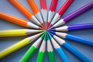
Primary - The colours red, yellow and blue which can be mixed to produce secondary colours.

Secondary - The colours purple, orange and green which are resultants of mixing primary colours.

Artist Research
Irving Penn
Irving Penn was an American photographer known for his fashion photography, portraits, and still life's. Penn's career included work at Vogue magazine, and independent advertising work for clients including Issey Miyake and Clinique. His work has been exhibited internationally and continues to inform the art of photography.
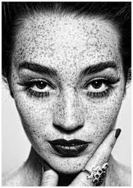
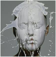
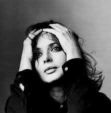
Image Bank
The following images were added as part of my visual research
Contact Sheets


Best Images
I have selected the following as my best images


Images That Need Improvement


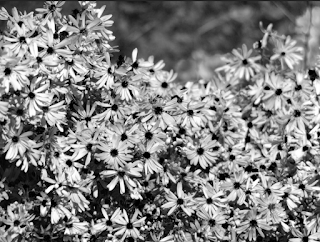
These following images don't include colour, as well as two of the images are not focused and are blurry. In the second image there is a fly sitting on one of the flowers which disturbs the image. The first two images are also poorly chosen objects to photography for this title of colour.
AO3: Record ideas, observations and insights relevant to intentions, reflecting critically on work and progress
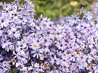
My first idea when photographing colour was to capture all the different colours in flowers and in nature. There was a variety of different plants to photography around the college. A challenge when photographing flowers is that they moved a lot in the weather conditions.
(photos dont link with irrving parr, chnage artist?)
AO2: Explore and select appropriate resources, media, materials, techniques and processes, reviewing and refining ideas as work develops
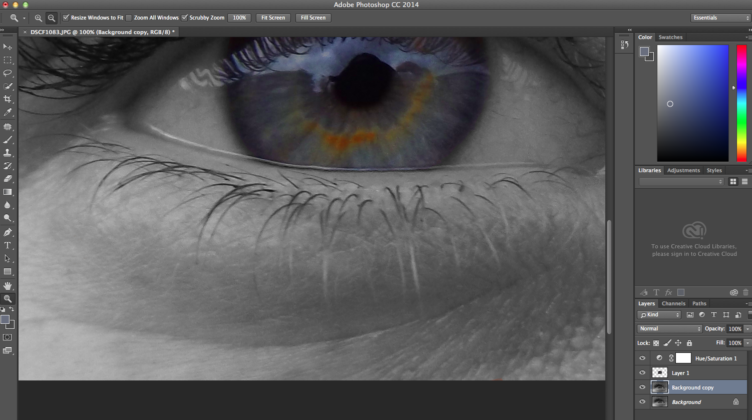
Original Photo:

Black and White Image:

When editing this photo I started with a black and white layer and then edited each colour to enhance the darkness around my eye and in my eye to then highlight the brighter parts of my eyes. For example the reflection in my eye came under cyan, as you can see I have made this part whiter and therefore highlighting an enhancing this section of my eye. I have made the blue and red parts of the image as they came under the ring of my eye and my face. Having these parts darker helped set a more of a contrast in the image and highlight the brighter parts.
Muted Image:

When editing for a muted image I lowered the saturation and brightness to make the colours softer, also making the whole image slightly blue to add a cold look to the image. I wanted to insure you could still see the detail of colour in the eye, therefore I made the colours around the eye lighter to help the colours in the iris stand out mote but without making them vibrant, therefore keeping the image quite muted. I used curved to balance out the brightness in the image as some parts of my face and eye were brighter than each other, this helps keep the image soft looking and muted.
Saturated Image:

When editing for a saturated image I increased the saturation to make the colours much more vibrant. To stop the colour of the skin looking too red i lowered the lightness of the image. I insured that when doing this it didn't dull the vibrance of the colours, the bright blue and orange Still stands out compared to other colours in the image but the skin is still softer and less over powering of them colours.
Experimental:

When editing this image there we several steps i had to take to get to this final product. Firstly i duplicated the layer and made the background unsaturated. The layer 1 over the top is the layer I put a colour selection on and then cut out the unwanted colours. This then left me with my black and white background with my coloured iris layer 1. I then changed the saturation to enhance the colours further.
When further editing my photos i removed certain blemishes to neaten the image by using the healing tool. Here are the before and after images of my healing tool editing:
Before

After
Before

After

Before

After

AO1: Develop ideas through sustained and focused investigations informed by contextual and other sources, demonstrating analytical and critical understanding.
The artists research helped me to create contrasting mages myself. For example the red and orange berries i put together to create analogous colours. As I was photographing I discovered that there was more colours around me than I thought and Irving Penn helped me to see this. I converted some images in black and white to compare to Irvin Penn's images, although i feel that most of my images are better when they are saturated.
AO4: Present a personal and meaningful response that realises intentions and, where appropriate, makes connections between visual and other elements.


AO4: Present a personal and meaningful response that realises intentions and, where appropriate, makes connections between visual and other elements.
The images I have produced I believe are a great representation of colour and have been refined to what I think are the best of my images.


I think that you have done reasonably well enough to just get a B however in subsequent shoots you will be challenged to create more refined final outcomes through camera technique and editing.. You have shot a lot of images showing a sustained and focussed investigation... :)
ReplyDelete