Tuesday, September 25, 2018

Shape

Shape 

Definitions

SHAPE (definition).
•A shape is an area enclosed by a line. It could be just an outline or it could be shaded in.
•Shapes can be either geometric, like a circle, square or triangle, or irregular.
•When drawing shapes, you must consider the size and position as well as the shape of the area around it. The shapes created in the spaces between shapes are referred to as negative space.
   

Artist Research

Floris Neusüss

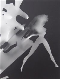
Floris Neusüss (born Lennep, Germany, 1937) has dedicated his whole career to extending the practice, study and teaching of the photogram. Alongside his work as an artist, he is known as an influential writer and teacher on camera-less photography. His works often deal in opposites: black and white, shadow and light, movement and stillness, presence and absence, and in the translation of three dimensions into two
Image result for floris neususs                                  Image result for floris neususs

Image Bank

These following Images are from my visual research.

The image is black and white to further enhance the shadows and light and therefore the shapes further being enhanced. The negative space Brandt has used is how the shapes are created in the image, for example he has cropped out parts of her face and parts of her body to create the triangular negative space you see in the image. I don't believe Brandt has taken the image to sexualise the model but to show how vulnerable women feel when they are sexualised. Brandt hasn't revealed all of the image as his aim is not to sexualise the model, but to show how she feels to be nude and open to other people. 

Related image
In this image negative space is used again to create a shape of an animal. The shadows and shapes from the models body are used to create an outline of an animal which is seen in the negative space of the image. The connotation of this image is to appeal to animal adoption and to show the love people have for their pets.


Contact Sheets


Best Images


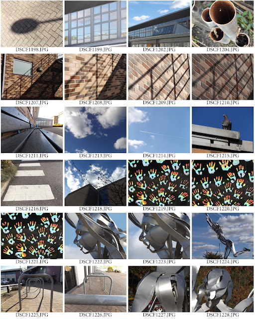
I have selected the following images as I believe they best represent my idea of what shape is in photography. I think I found shape in intriguing objects and some interesting angles. 

Images that need improvement


I have selected these images because neither of them was thought out very well. The first images background isn't very clean or thought out, the exposure is also too bright in the back ground. The second image has too much negative space and is slightly blurry due being zoomed in so far, the slightest movement will make the image blurry. In future shoots I would use a tripod and to also make sure my background in my images are cleaner.

AO3: Record ideas, observations and insights relevant to intentions, reflecting critically on work and progress.
My idea for shape was to capture abstract shapes and to experiment cropping my images when taking photos. I feel i was successful with cropping in my first best image, it is also an unusual shape. This best image is in fact a corner of a bench. I was inspired by Floris Nuess to capture different shapes and angles which I believe I have successfully captured, for example in my second best image i feel it links with Floris the most as it is human form similar to his images. The variety of lines and shapes used to create her face make it intriguing and abstract.

AO2Explore and select appropriate resources, media, materials, techniques and processes, reviewing and refining ideas as work develops

Camera Settings


Photo Shop
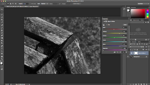

In this I decided to edit it black and white to darken an enhance the shadows and lines in the image, highlighting more shapes in the image.
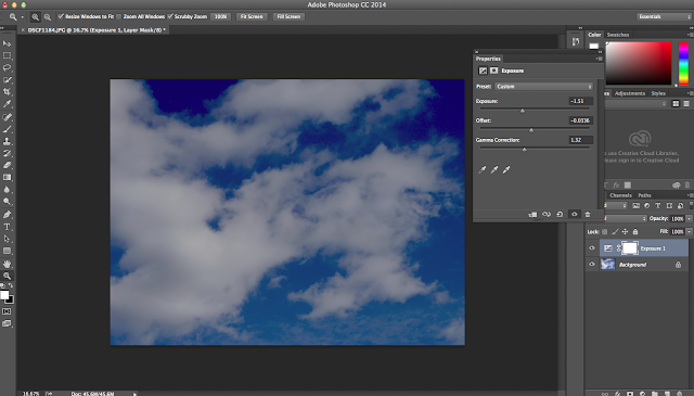

In this image I wanted to enhance the beautiful blue sky, this helped to outline the various shapes within the clouds. The image was also a bit bright, to edit this I lowered the exposure.
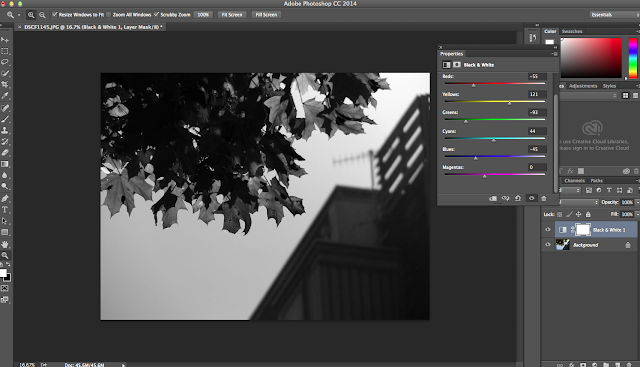


AO1: Develop ideas through sustained and focused investigations informed by contextual and other sources, demonstrating analytical and critical understanding

The artist research was helpful to me as i was able to discover new angles, as floris photographs from beneath his objects, i tired capturing images from above. This research helped me by looking for new shapes and perspectives to create an abstract image, for example shadows and closer perspectives to crop the image and create shapes with negative space. I feel I need to extend the objects i am photographing and start taking photos of people to further link with Floris.

AO4: Present a personal and meaningful response that realises intentions and, where appropriate, makes connections between visual and other elements. 


Camera Controls

Main Apertures 
2.8
4.0
5.6
8.0
11.0
16.0
22.0

Shutter Speeds
2"
1"
1/2"
1/14"
1/8"
1/15"
1/30"
1/60"
1/125"
1/500"
1/1000"
1/2000"
1/4000"

ISO settings ( international standard organisation) 
100 sunny day
200
400 cloudy day
800
1600 night time
Image result for ev camera


Thursday, September 20, 2018

Texture and Pattern


Texture and Pattern

Definitions:

Texture

Texture photography is one way of drawing the viewer's attention into the image. Photographs that use this technique create impact by showing different textures.
Texture refers to the tactile qualities of the physical surface of the object, in other words how does the surface feel when you touch it.
Light is important when taking photos of texture as having a focused light from an angle it will emphasise shadows of certain contours in the texture.

Pattern

Pattern is the repetition of lines, shapes, tones or colour that can create interesting images. There are photographers who use the pattern as the main subject of an image while others use it to enhance the overall composition and look of the photograph.


Image Bank

Here are some examples of texture i found in my visual research

Texture


Image result for texture photography


Image result for texture photography


Image result for texture photography


Image result for texture photography

Pattern


Image result for pattern photography

Image result for pattern photography


Image result for pattern photography


Artist Research

Ansel Adams

Ansel Easton Adams was an American landscape photographer and environmentalist. His black-and-white images of the American West, especially Yosemite National Park, have been widely reproduced on calendars, posters, books, and the internet. Adams and Fred Archer developed the Zone System as a way to determine proper exposure and adjust the contrast of the final print. The resulting clarity and depth characterised his photographs. He primarily used large-format cameras because the large film used with these cameras (primarily 5×4 and 8×10) contributed to the clarity of his prints.


Related image
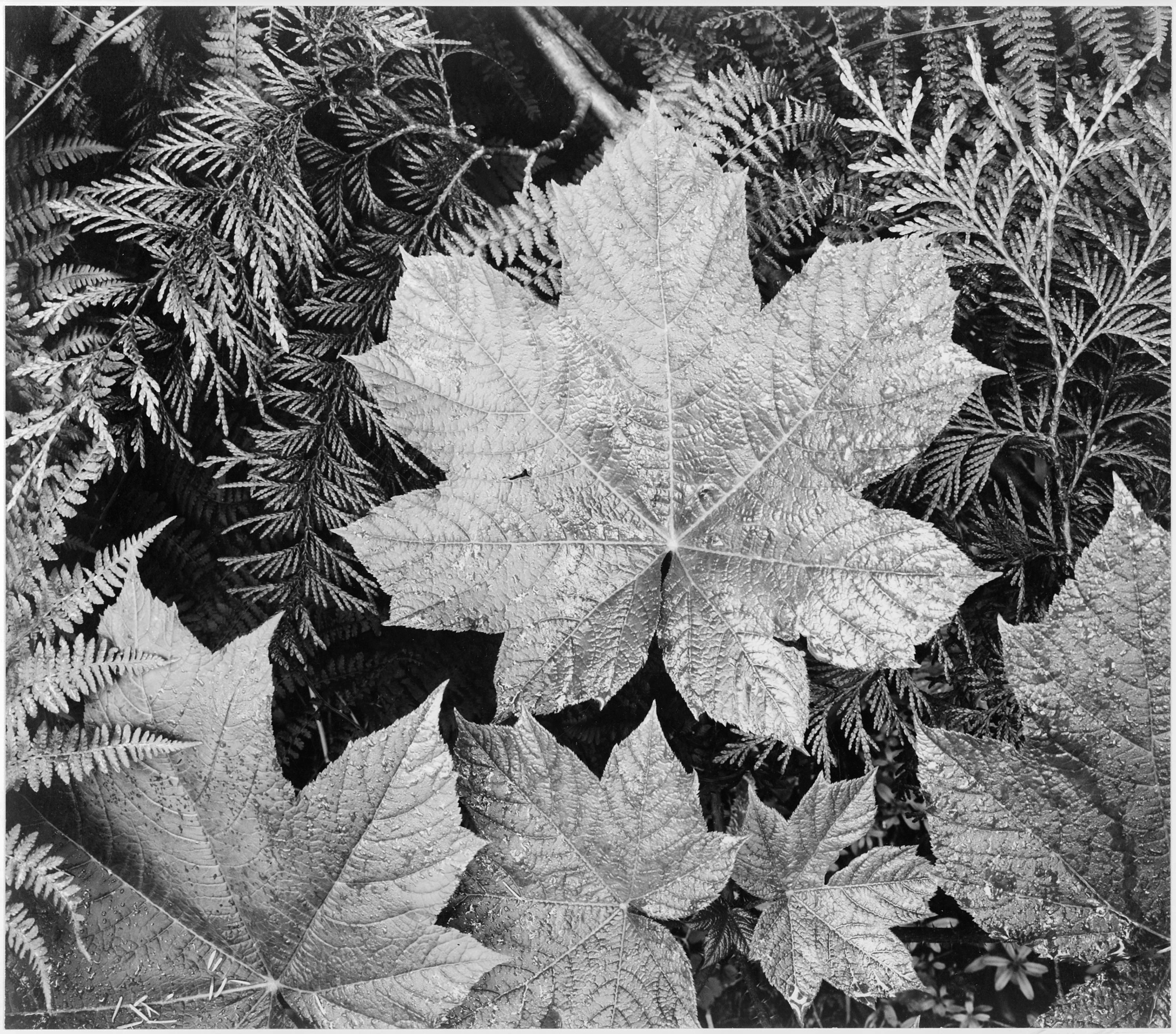
This photo by Ansel Adams features leaves from different species of trees, the leaves used implies the time of year. This connotation shows that it is Autumn/Fall because of the species of leaves being common around that time of year, the colour of the leaves and the fact that the leaves are on the floor. The image is also black and white, this defines the texture in the leaves. For example the veins in the larger leaves, not only do they show texture but the veins also represent pattern. 


Image result for ansel adams texture
Similarly to the past photography by Ansel Adams, the chosen object to photography indicates the time of year. Pine cones can be found on the floor during the season of Autumn/Fall, therefore this connotation is a good indication of the time of year. Along with the Pine cones, the leaves and twigs on the floor have changed colour and do not look healthy and green, this further indicating the time of year. Like his other images, this one is also black and white; The texture is defined further by enhancing the shadows created in the image and highlighting the brighter parts of the image to create a contrast and therefore enhance the texture. Within this image there is also a pattern, the pine cone itself is a pattern with the bus scales that create a symmetrical pattern. 


Contact Sheets


Best Images

The following images are the ones I feel are best out of my contact sheets           

        Texture        


Pattern


Images That Need Improvement


These images were selected as neither are focused correctly in the image, this is because i have zoomed in too far with my lens. Image one was hard to capture as it was so small and hard to focus on. Image two however was down to the fact I did not focus my lens properly when taking the picture. If I were to re-shoot I would pick up the smaller object and photograph it somewhere more appropriate as the camera focused on the grass around the object and not the object. Also insure my camera is focused properly before I take photos. The Composition of these images are not appealing either, as they aren't centred and are basic. 

AO3: Record ideas, observations and insights relevant to intentions, reflecting critically on work and progress

My ideas for texture and pattern was to use my cameras macro setting and try to catch as much as the finer details as possible. This was really successful for me as i took photos of objects  wouldn't expect to have a rough or smooth texture.
One challenge I found when taking texture patterns was that my camera wouldn't also focus easily on some objects. to over come this I would use less of the zoom on my lens and take photos close up myself. 
My images came out as I expected however focus was a the main issue for me. For example my third best image has great detail of the shoe and also the floor. These are two contrasting textures, smooth and rough. This is why it is one of my best images. my third image for pattern is very symmetrical and  has a great composition, along with the detail that can be seen on the metal drain. The squares create a nice and abstract pattern.

AO2Explore and select appropriate resources, media, materials, techniques and processes, reviewing and refining ideas as work develops.

Camera Settings


Photo Shop
To improve my images I decided to import some of them into Photoshop and use this to create black and white images to define the textures in each image.


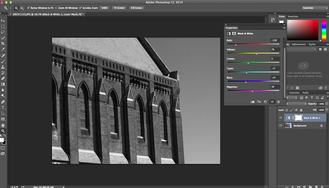
When editing these images, I quite liked how the original image came out so, all I did was make the image black and white and change the settings of certain colours. I wanted there to be a contrast between the lighter and darker colours; Therefore, in the first image, red colours (colour of the floor) are darker and yellow other colours are lighter. In the following images they all had similar colours, therefore the green was darker and any other colours were either made lighter or darker to create the contrast. I wanted to make the images black and white as I think it highlighted the textures seen in the images, for example the shoe and the floor, or the texture seen in the leaves.


AO1: Develop ideas through sustained and focused investigations informed by contextual and other sources, demonstrating analytical and critical understanding.

My artist research on Ansel Adams helped me as i was able to find texture in objects i would not have expected. It made me think about what i am taking images of and how the detail will look in macro settings and how enhanced the texture will be in black and white. It also helped me find texture that also have patterns within. For example smooth leaves with their veins creating patterns throughout. I developed my images based on his black and white final images. I love how the unsaturated images creates more shadows in the objects and adds more texture to he image.


AO4:
 
Present a personal and meaningful response that realises intentions and, where appropriate, makes connections between visual and other elements. 

I believe I have produced a strong series of images inspired by Ansel Adams, My photographs of nature shows much detail and creates a peaceful feeling similar to Ansel Adams images.